
Waitrose & Partners Rapid Delivery, at your fingertips.
I was part of a team working on bringing Waitrose & Partners groceries store to door in 2 hours or less. In the knowing that the groceries are, of course, the finest quality we set out to make the mobile site work just as hard.
Getting my head around the problems.
Some of the issues with the original interface, identified from analytic, heuristic evaluation and against Baymard Institute benchmarks were that the categories were too broad, vague and users could not infer the scope of products easily.
Also, in the secondary hierarchy, pages were hidden and not directly accessible from the homepage. On mobile, via the menu, categories could not be accessed, which was an issue.
Users are the best helpers for content design.
We organised a card-sorting research activity where participants were asked to rank their needs, in priority. And for those we hadn’t anticipated, we came with a questionnaire to capture what it is that they were looking to do.

Card-sorting research establishing user-need and scenario hierarchy.
Searching for what you fancy easier.
Since user experience is all about addressing user pain points as well as optimising the experience, we set to work organising the categories better, improving the site navigation and changing the visual quality of the UI to get across the breadth of what’s on offer. Simply put, what we were striving for is an effortless process to search according to criteria, find your items and make — as the name suggests — for a Rapid shopping experience.
HiFi mockups.
As per the user research, improving the ‘filter categories’ process is one of the most crucial features to address in their Rapid shopping experience. Plus, making the content within categories bite-size and easily scannable. There were many iterations involved, and user testing helped the UX designer and I sharpen the experience for maximum understandability.

Coded prototype of category shortcuts as per user research activity.
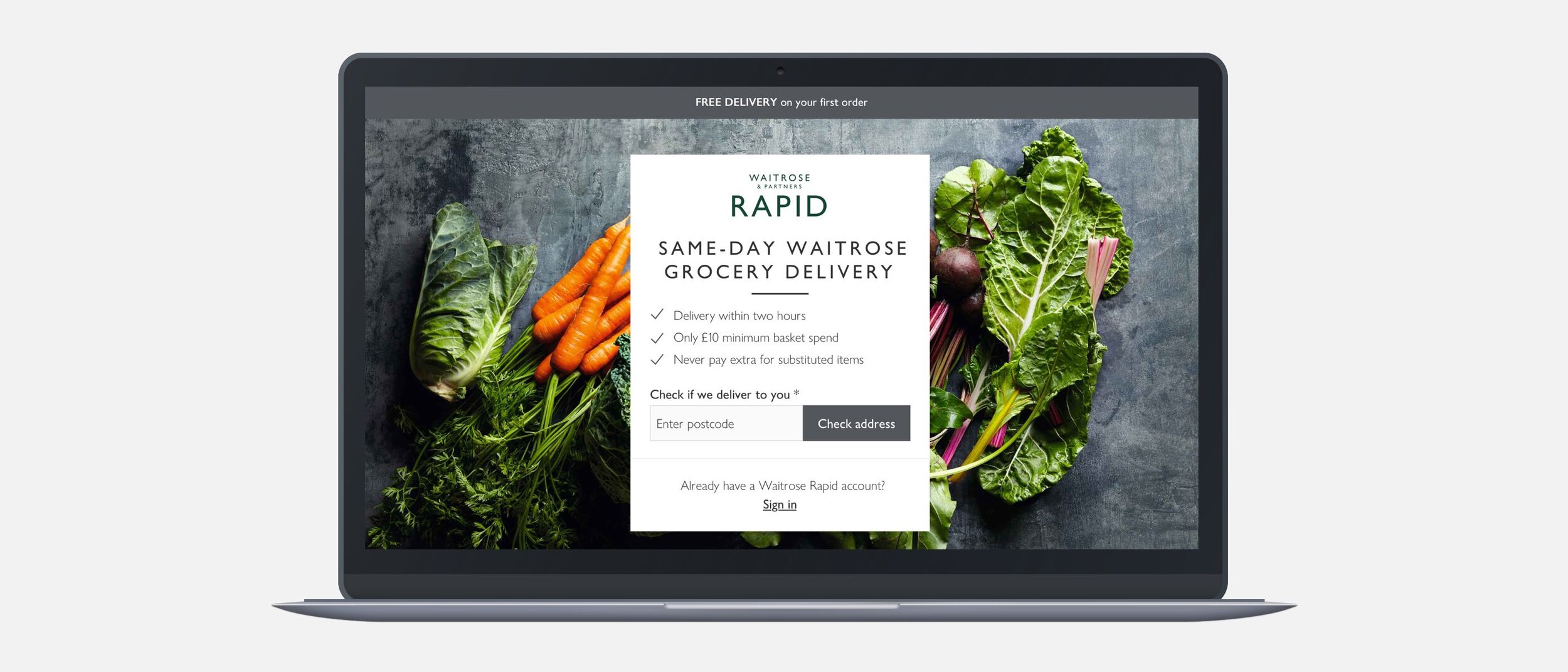
Landing page redesign.
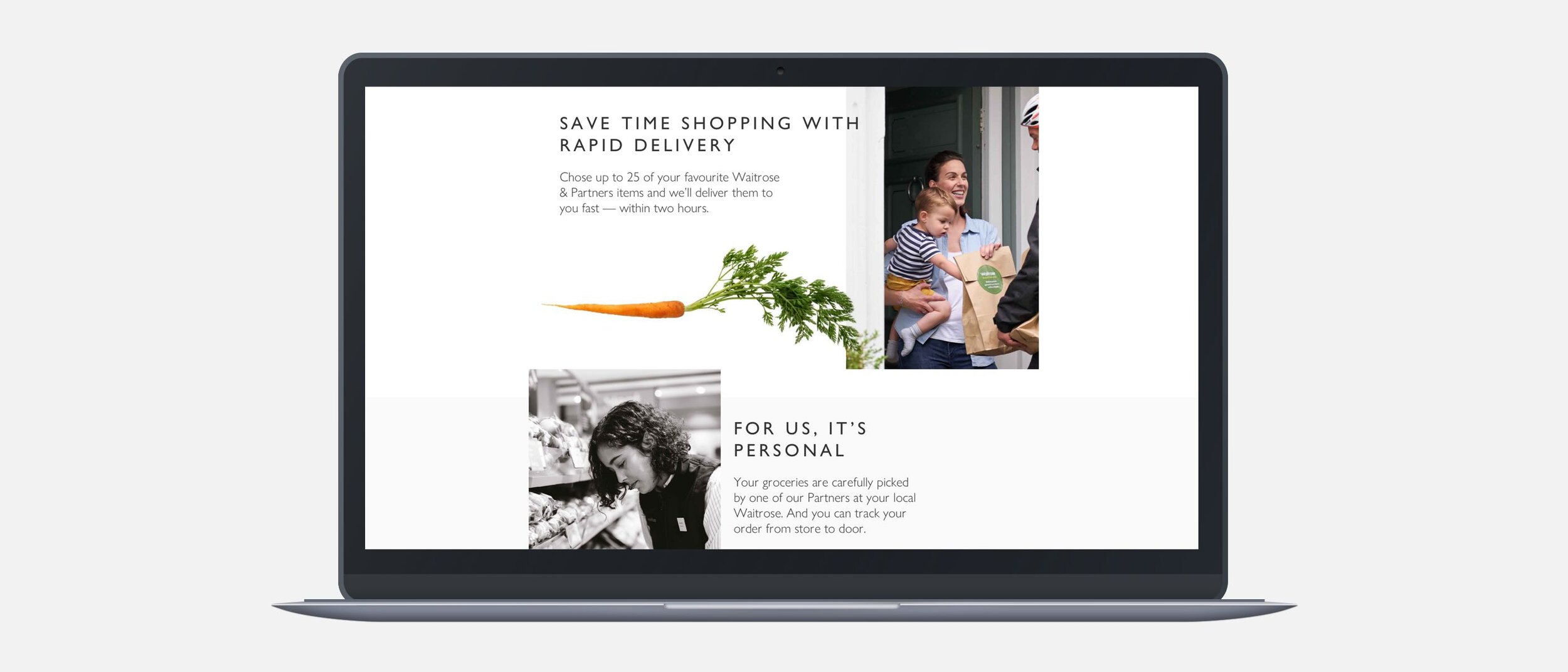
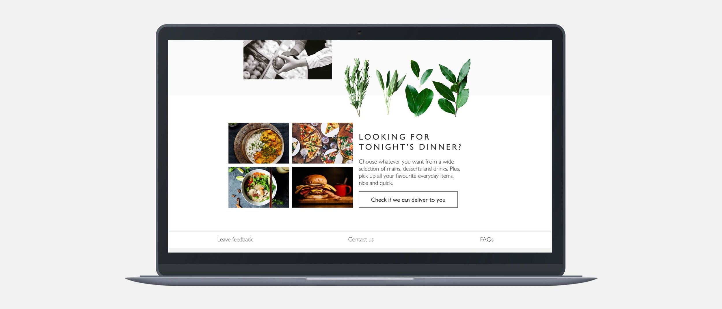
Overall, I saw that the content design behind the homepage needed to be much more concise and visually stimulating. It needed to convey the ease and simplicity of getting Waitrose groceries delivered. So, I created an easily scanned piece of content around the postcode finder that used active language to convey what it is in terms of benefits. I then validated these benefits in slightly longer-form content which were featured alongside engaging lifestyle photography.
Some takeaways.
The UX of Waitrose Rapid demonstrated the importance of user research as well as snappy content and visual simplicity. As much as stunning designs do stand out, with a service like Rapid the UX is way more effective when the user has an effortless time navigating the content in a simple, scannable way, which is what we achieved.