
A bit of background.
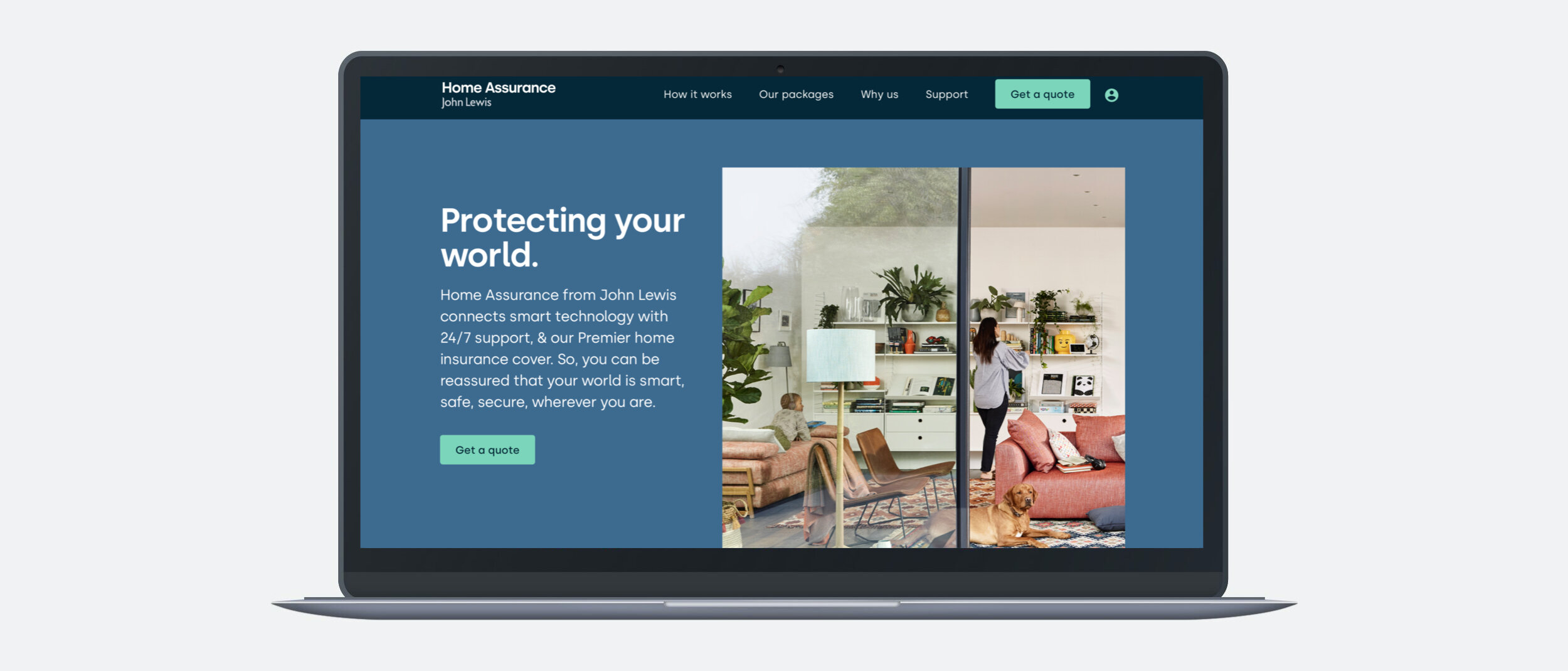
Home Assurance from John Lewis & Partners combines smart technology and home insurance to protect the home and what matters most.
Problem and pain points.
Challenged with the pain point that it was difficult for customers to understand the product with the old homepage design I set to work. One of the objectives from the underwriter was that we had to lead with insurance being at the forefront, despite the smart tech intuitively feeling like it should come before it, hopefully preventing customers from ever needing the cover. Another challenge was that it didn't feel like a holistic product, which made the price seem high. What’s more, we needed to get the message out there in a few seconds.
Interviews with forerunning customers.
The UX Researcher conducted two-hour interviews with five participants who had been using the service for about a month to six weeks, with the aim to see which parts of the product they felt were the most valuable as well as some of the pain points they were experiencing.
Motivations for using Home Assurance.
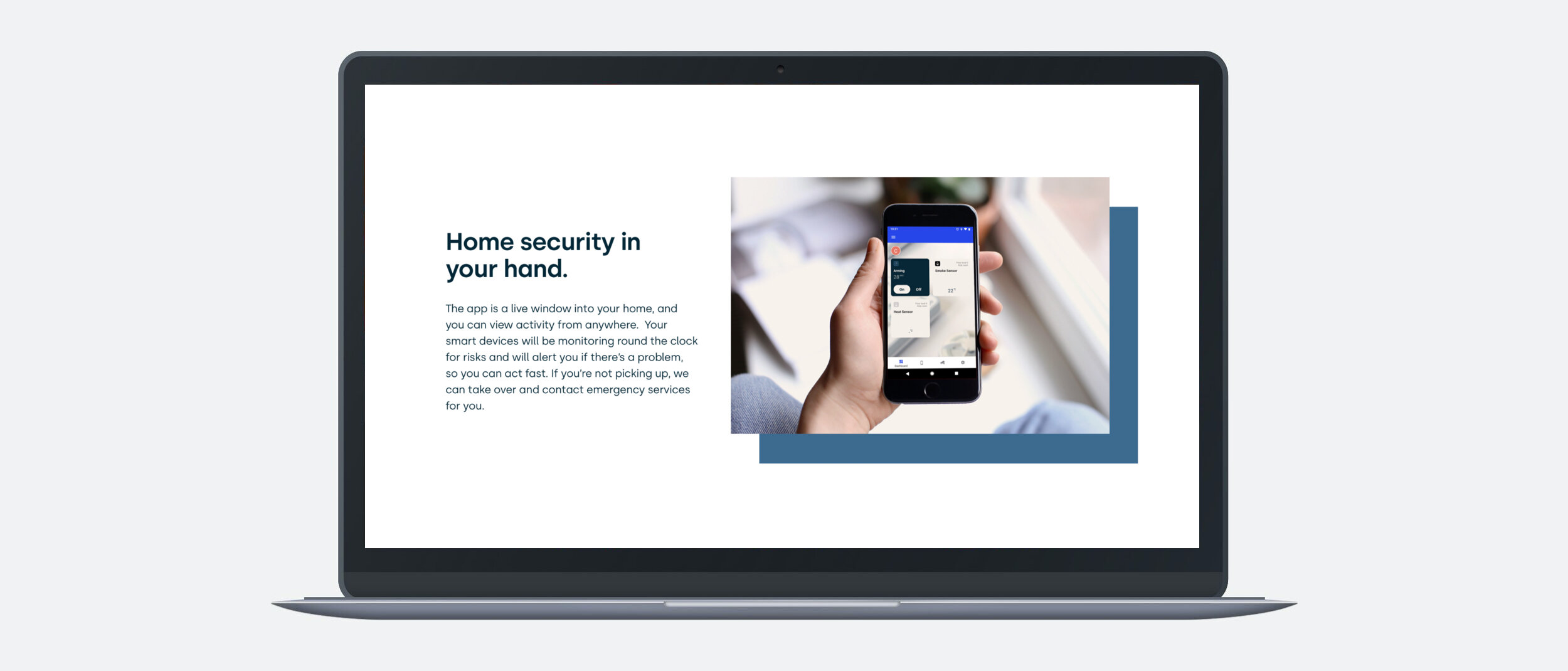
From these interviews, we found out that the main user goal is to increase the security of their home by adopting a new and more sophisticated security system with the peace of mind that comes with John Lewis & Partners installation, customer support and guarantee.
A secondary user goal was a one-stop solution found all in one place with 100% protection. Plus, the ease of finding, purchasing and installing a full coverage home safety solution without the hassle. Also, the smaller, newer and nicer looking devices that enhance the aesthetics of their house as well as giving the impression to intruders that the technology is up to date.
As per the interview transcripts and watching the diary studies, it became clear that the messaging had to get across the user benefits of feeling protected as well as elude to the nice shiny smart tech.

Home Assurance in a nutshell after many iterations with the product team.
Getting across what Home Assurance is in a mobile-first way.
Let's face it; we all knew it was a complex product. And it was becoming clearer that we needed a concise encapsulation of all the different elements, instead of what was previously happening on the old homepage, where customers were doing all the work in scrolling and trying to patch together the intricacies of what they were getting.
Messaging hierarchy.
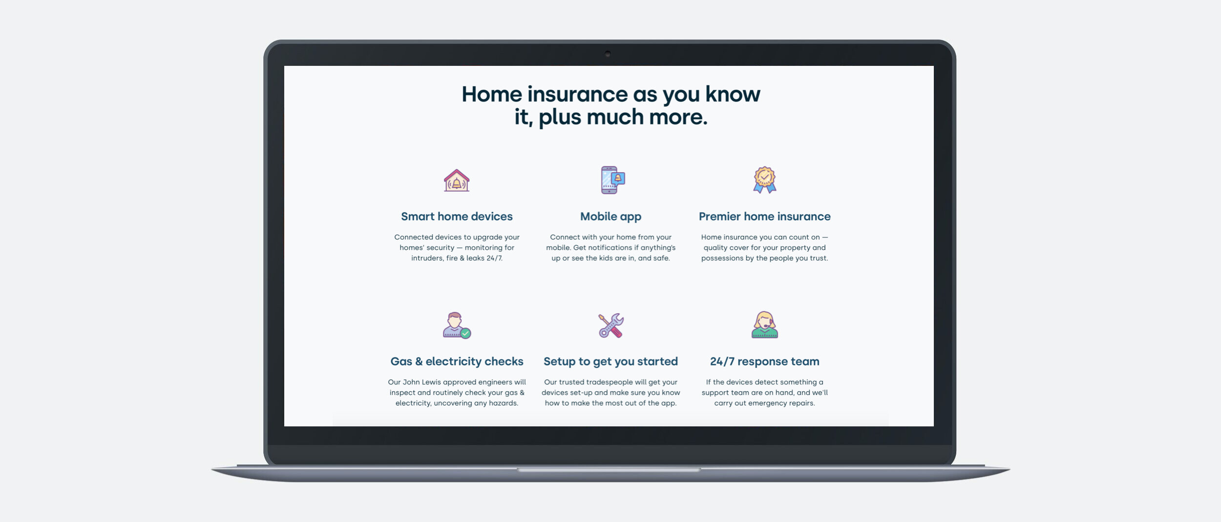
As the primary objectives was to lead with home insurance as this was a direct instruction from RSA. I gave them prominence with the second headline: "Home insurance as you know it, plus much more." This fulfilled the brief as well as setting the scene for devices that monitor for fire, leaks and intruders.
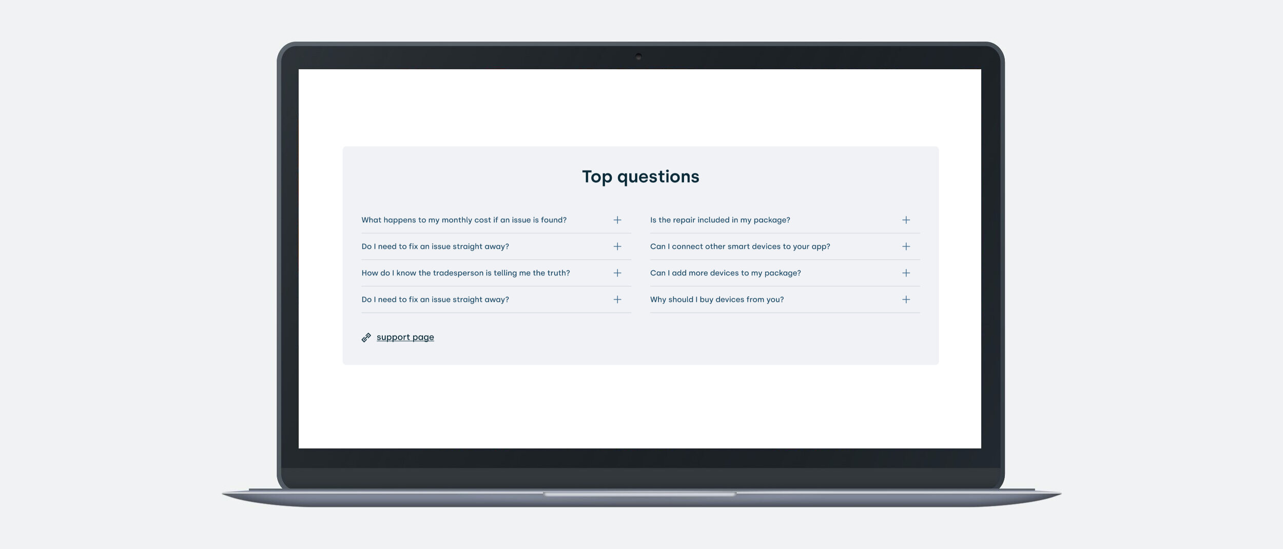
Working closely with the UX designer, we decided to unpack these with icons and snappy headlines and subheads. Feeling that we needed to unpack the app and insurance with some longer-form content.
Improving the packages UI.
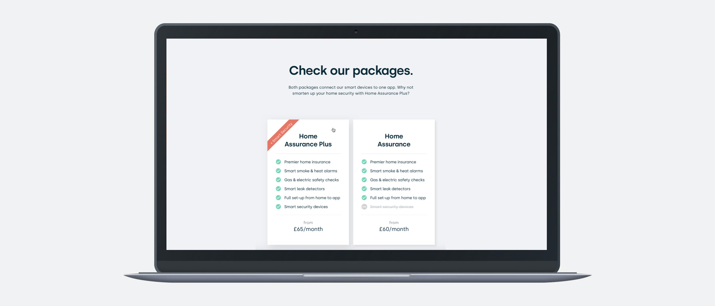
The previous designs were complex and busy, and users were confused between the two packages. From the interviews it was clear that customers thought that the security cameras were an attractive part of the product, and as we only feature these in one package it became clear that we had to find a way to show this so it was quick and easy for the user. With microcopy, icons and laying the packages adjacent to one another for clarity and distinction we made quite an improvement to the UI.
Reminding the user about the benefits.
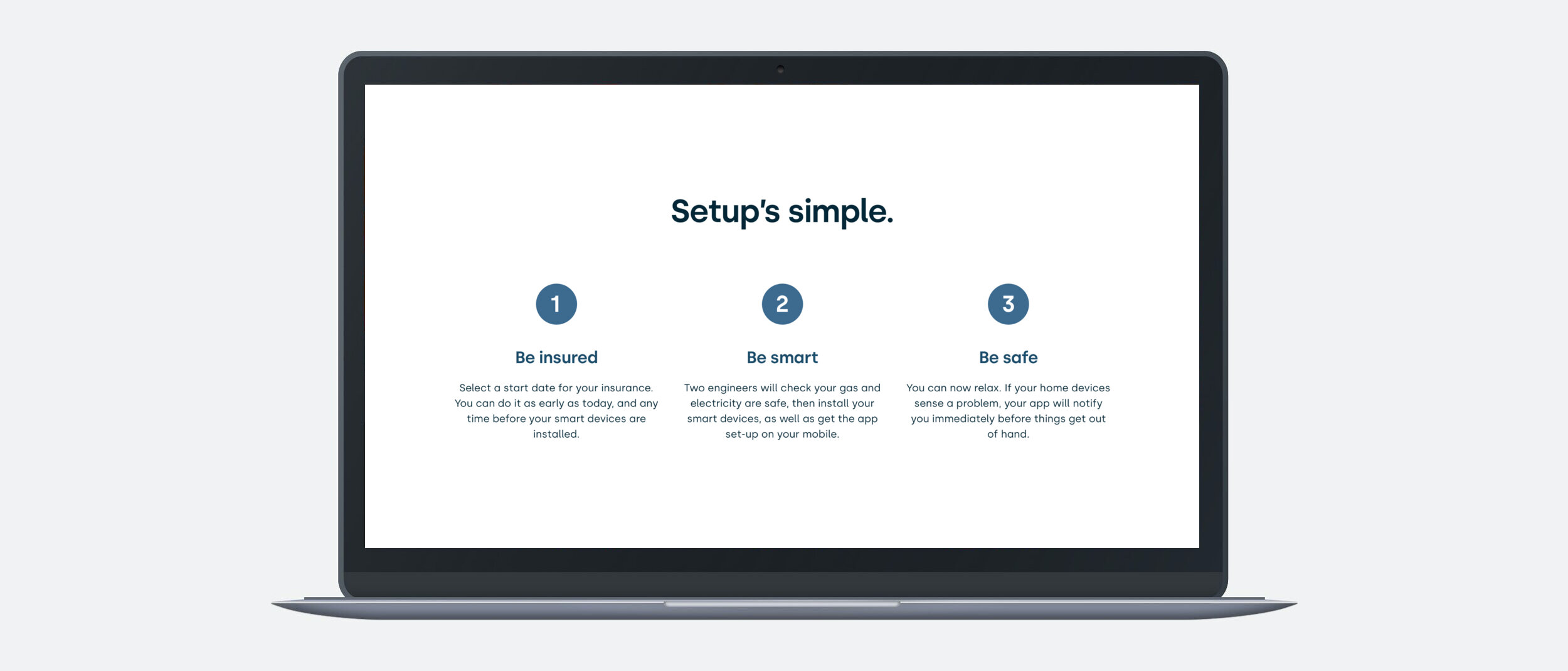
To end we rounded off with how simple and easy everything is from setup to protecting their world. The trust element was reinforced by rounding off with the stakeholders involved in bringing the product to market.

Hi-fi core navigation.
Taking it all the way through.
Working with marketing I created a series of comms to go out to John Lewis & Partners future of loyalty customers. Also a set of quote to conversion nurture emails triggered by time and behaviour.
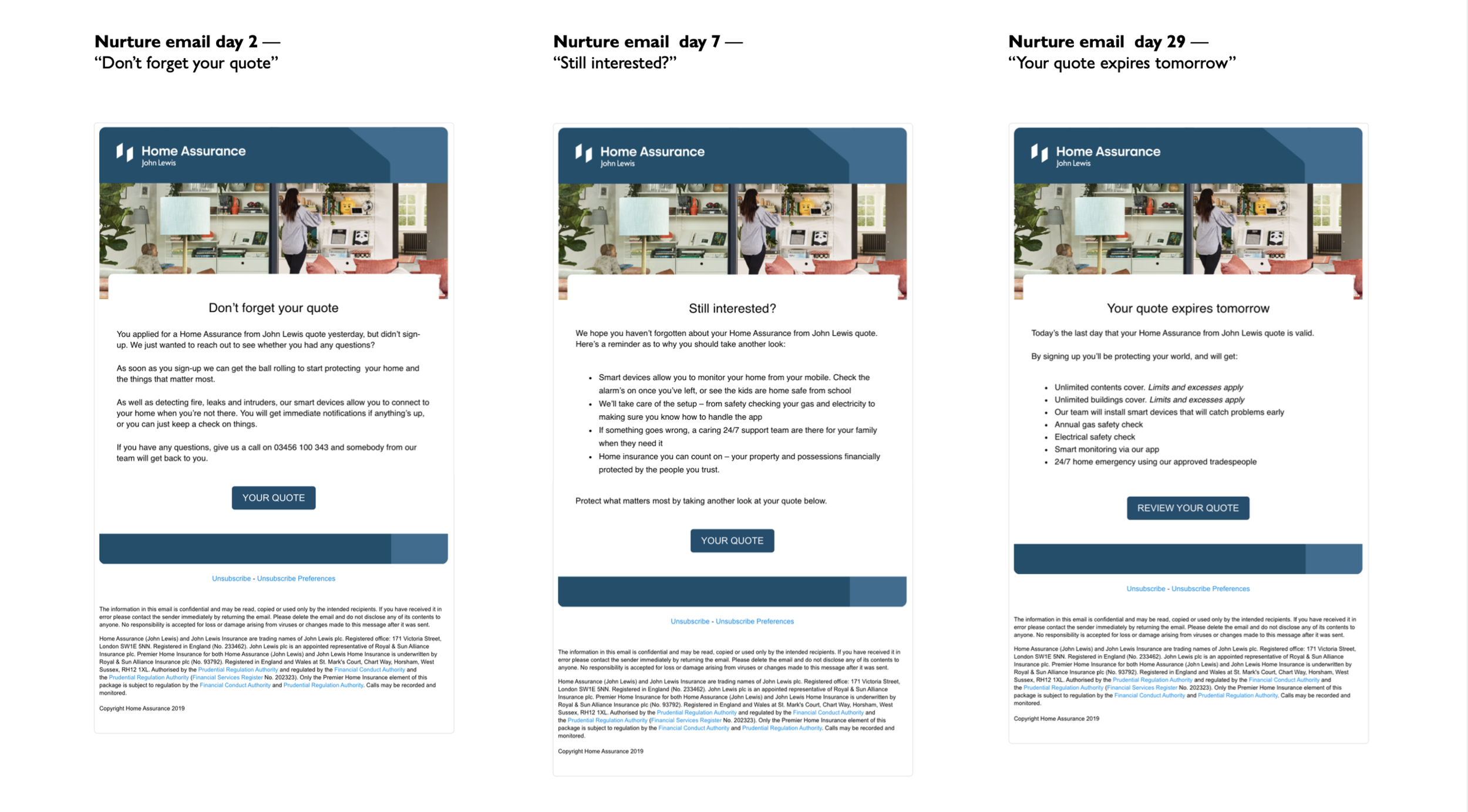
Part of the the quote to conversion nurture email journey.
Clicking through to purchase.
One problem we encountered was that customers were taking out a quote but not going any further once they'd received it. There were many hypotheses as to why this may be happening, but we were stumped. We decided to run a ‘barriers to purchase’ survey to empathise with ‘exit-intent’ in more detail. Initially we asked questions to size the typical barriers to conversion around renewal, appeal and next steps in the insurance journey. We then asked a sub-series of questions to understand the context and opportunities.
Thoughts so far.
It's early days for Home Assurance, it's very much in a test and learn phase, and it's only going out to loyal customers. I would like to say that the UX Designer and I got the new homepage into a more organised state and the UI has way more clarity.
And for the rest — we'll just have to wait and see.